{tocify} $title={Table of Contents}
You've read the basic concepts flexbox know? If not, you can seek to know what it flexbox in various sources. Help Google is highly recommended. You can read here for an explanation of the concept in general flexbox. For the first flexbox tutorial we will create a navigation bar using flexbox.

Create a simple markup represents the relation parent (ul element with the class nav) and child (li element) and displays the nav button.
<!DOCTYPE html>
<html>
<head>
 <title>Flexbox</title>
</head>
<body>
 <ul>
 <li><a href="#">Item 1</a></li>
 <li><a href="#">Item 2</a></li>
 <li><a href="#">Item 3</a></li>
 <li><a href="#">Item 4</a></li>
 <li><a href="#">Item 5</a></li>
 <li><a href="#">Item 6</a></li>
 </ul>
</body>
</html>
Previously, CSS3 add a display to visualize clearly what we want to learn this time.
/* // Style overall ------------------------*/

* {
 box-sizing: border-box;
}
body {
 margin: 40px 0;
 background: #203542;
 font-size: 1.3em;
 font-family: helvetica,sans-serif;
}
.nav {
 margin: 0 auto;
 padding: 20px;
 width: 80%;
 border: 2px solid #1d2e3a;
 border-radius: 10px;
 background: #156596;
 list-style-type: none;

}
li {
 margin: 10px;
 border-radius: 10px;
 background: #FFB70F;
 color: #858585;
 color: #203542;
}
.nav a {
 display: block;
 padding: 15px;
 color: inherit;
 text-decoration: none;
 font-weight:bold;
}
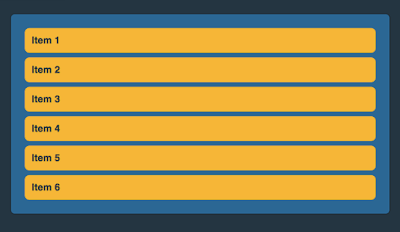
And the results are as we expected, some rectangle that runs vertically down to form a list.The result :
+Layout+Basic+CSS+Tutorial+1.png)
After that, we add flexbox properties by adding;
/* // STATE Flexbox ------------------------*/
.nav {
display: -webkit-flex;
-webkit-flex-direction: row;
-webkit-justify-content: space-between;
-webkit-flex-wrap: wrap;
}
To avoid cross browser issues do not forget to add the prefix-webkit,-moz,-ms and-oThe result :
+Layout+Basic+CSS+Tutorial+2.png)
You see the difference ?
Flexbox Modules, making the class nav flex container with elements as flex items. Layout was changed to horizontal spread due to the selected row direction (and indeed this value is the default value direction). And note, it's interesting that when we viewport minimize large, flex items will adjust to the current proportionally. We do not need to bother to set up a large space in between the flex items.